Wireframes
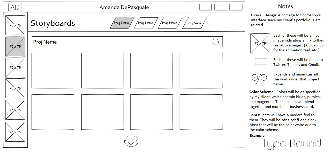
I created 4 different wireframes. Each wireframe is a sample of the "Storyboard" page which will be implemented on the website. Designs are meant to show versatility and thus the final design may encorporate elements from all 4 concepts. Click on each button to view their respective design in detail.
*** Update: After reviewing the designs with my client, we decided on going with design #2! ***
Toggle Menu

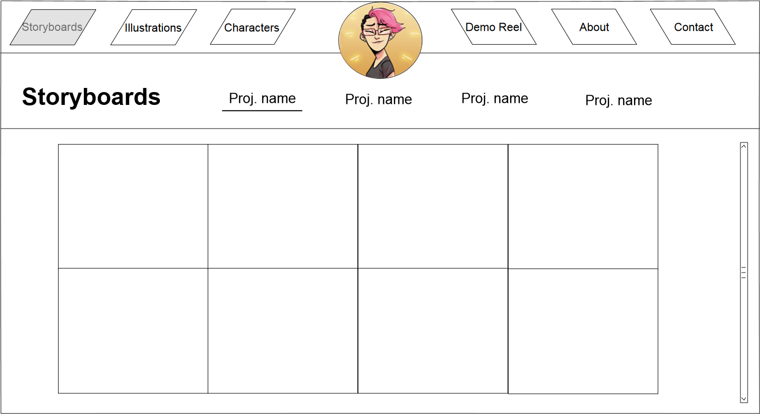
This design has a clean and modern feel to it. The navigation at the top turns grey based on the page that you are on. Once a page is selected, a jumbotron comes down to reveal the different categories within that page. The user can then jump to those categories by selecting them (as indicted by the underline).
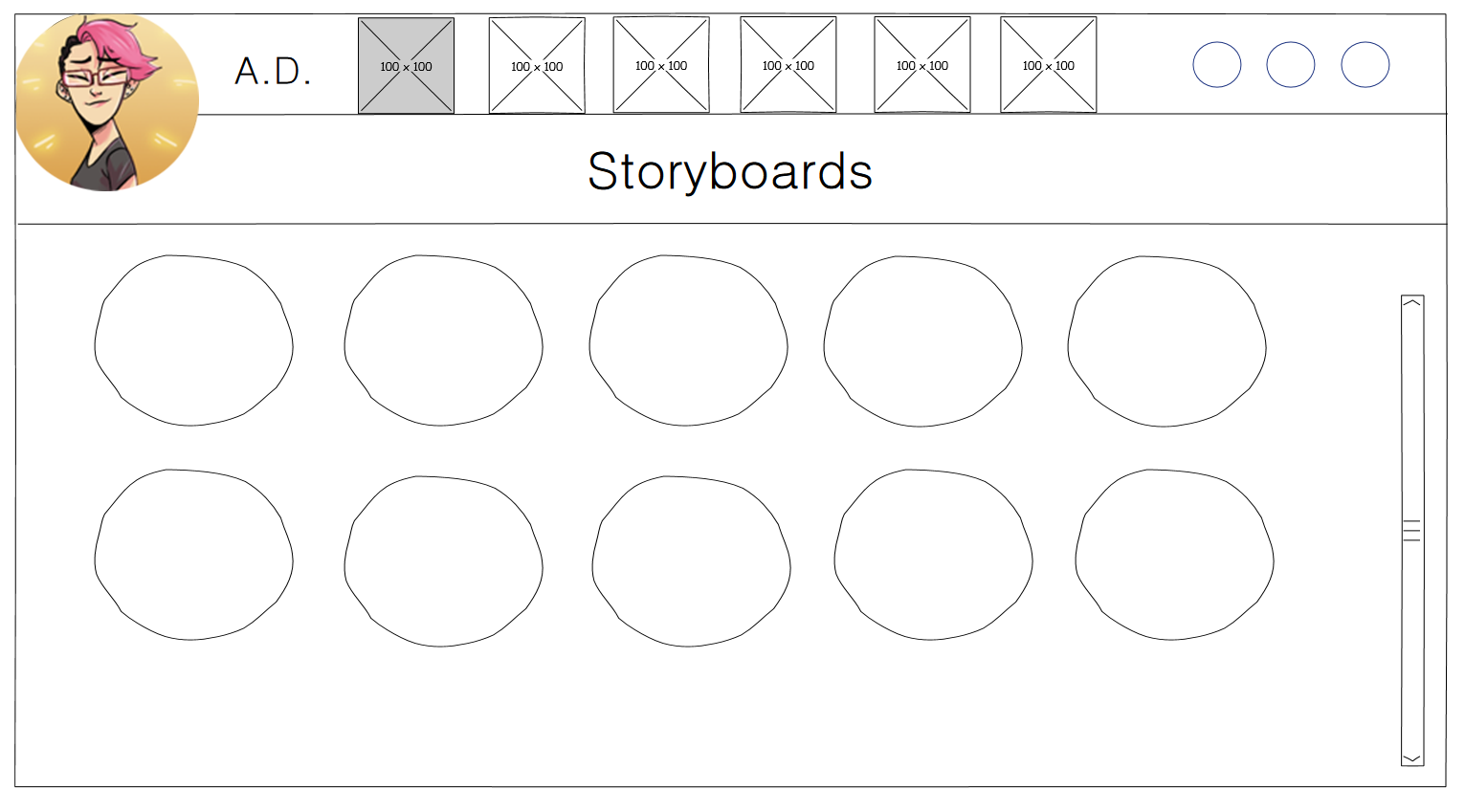
Circles! And lots of 'em! This design is meant to be more fun - showing off a very sleek and soft side. The image placeholder at the top are similar to design #1, where each image will be an icon linking to another page on the website. Work will be shown off inside of the large circles and will have a standard scrollbar to see more. The 3 circles at the top are filler for social media icons: Twitter, Tumblr, and Gmail.
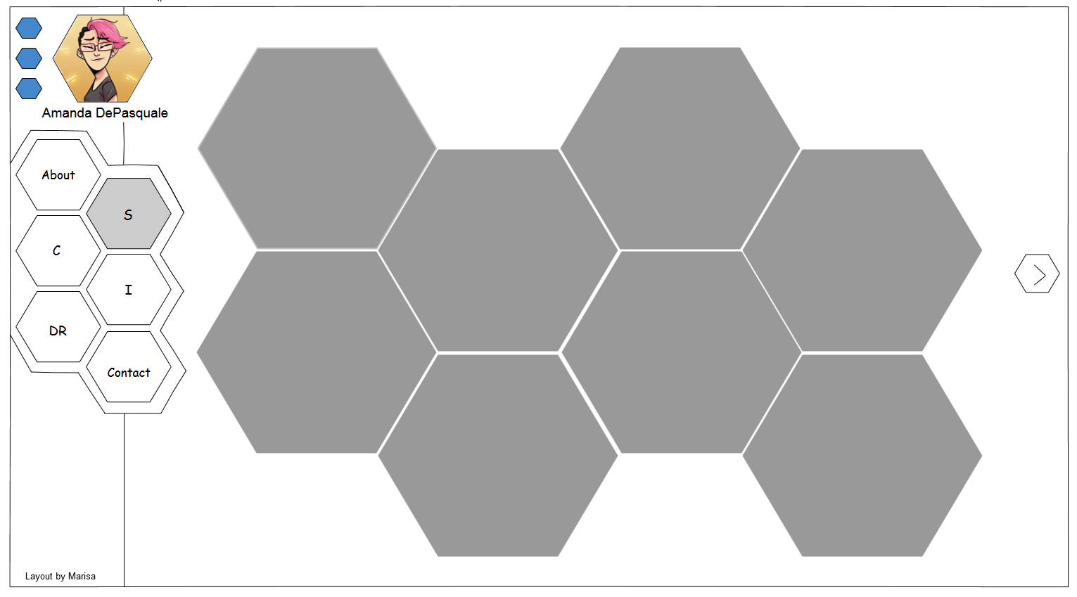
This design is unlike all the others because it features hexagons to portray a geometrical and abstract perspective. The giant grey hexagons will be filled in with my client's work. Users will be able to click the hexagon on the right side to scroll to more work. The 3 blue hexagons are fillers for Twitter, Tumblr, and Gmail icons. Text for this layout will feature very straight and edged typeface as opposed to rounded (which would be used in the previous 3 wireframes).
